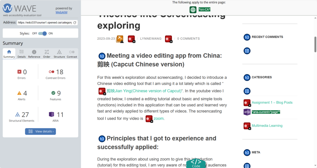
WAVE accessibility report
When I was viewing my WAVE accessibility report on my first blog post, I found out the fact that although it may looks good, I have no idea about where I could make errors and how I can improve them if I did not use this tool to check my blog style. What was surprising is that there were lots of contrast errors in my blog which means that the color I had for some of the words (especially those with links together) were very light so that it made the words unclear for people who has difficulty distinguishing colors to read. What I expected was that I had lots of structural elements which I think implys that I somehow have a good layer of putting different informaiton into categories that suit them. I think for future creation, I will probably try to avoid the contrast errors as much as possible by changing colors to darker ones about those words that are unclear to see.
My feelings after exploring Text to Speech tools
If talking about my personal experience, I have to admit that I have never used Text to Speech tools before. I tried several times struggling to adapt to this function but it did not work out because I had a hard time figuring out the meanings of sentences according to what the artificial voice saying, and it ended up even wasting more time compared to reading those texts by myself. This time I tried to use TTSReader to explore Text to Speech tools again and I did the task of letting the website read my blog post 1. However, same thing happened: I can catch the information at first, but after reading ffor a while, I could not understand what it was saying because the tone of voice and the position of punctuation are both strange, and the duration of punctuation is also incorrect which obviously affect my ability of absorbing the information.
My Canva Infographic
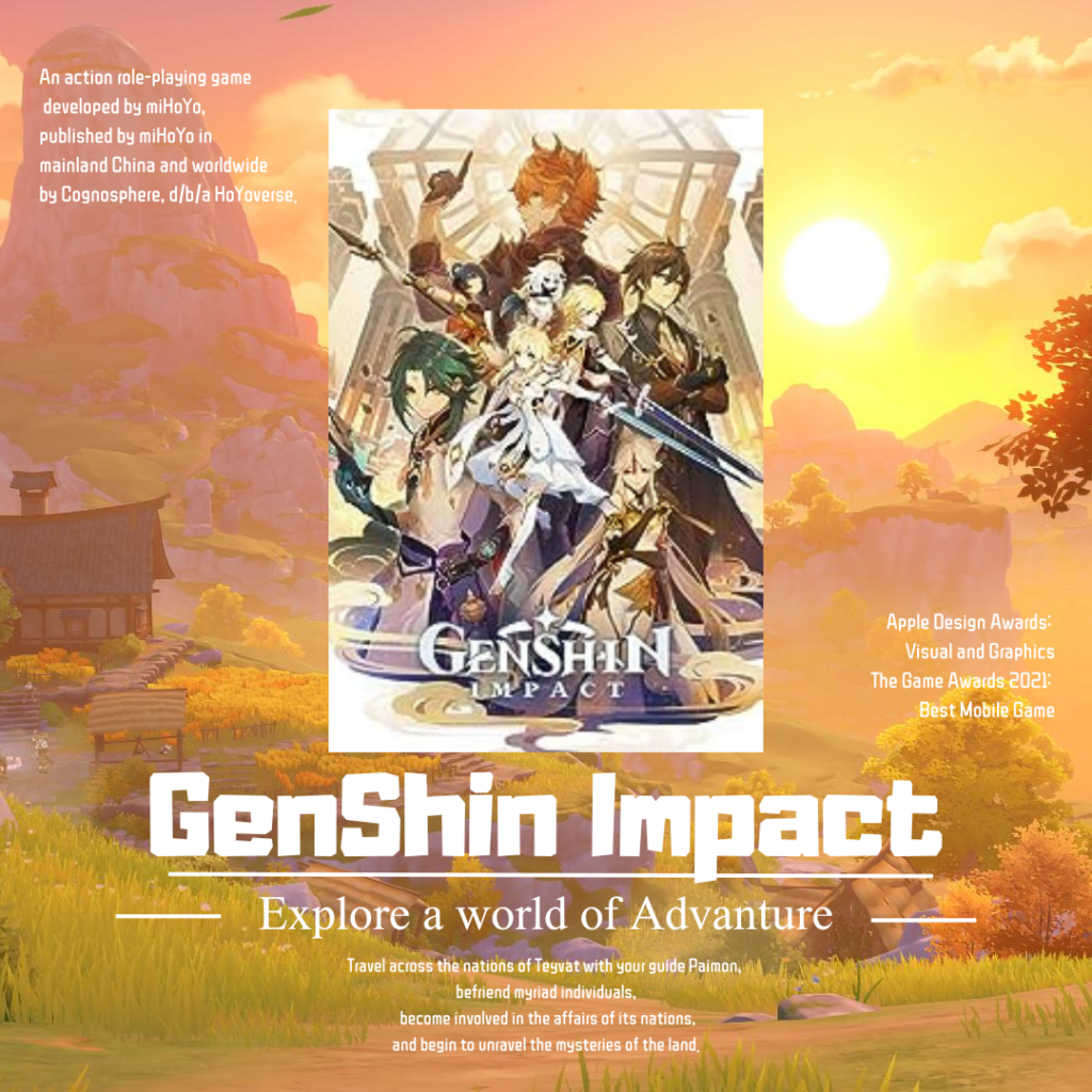
ALT Text: This is an infographic image about an action role-playing game called GenShin Impact developed by miHoYo. This game is published in both mainland China and worldwide. It has won awards such as Apple design awards: visual and Graphics and The Game Awards 2021: Best Mobile Game. The game is about a travel across the nations of Teyvat, befriend myriad individuals, becoming involved in the affairs of its nations and begin to unravel the mysteries of the land.
During the process of designing this infographic, I used all other principles (1. Focus on alignment, 2. Use hierarchy to help focus your design, 3. Consider proximity when organizing your graphic elements, 4. Make sure that your designs have balance,and 5. Optimize colour to support your design, Leave lots of negative space) except these two: Leverage contrast to accentuate important design elements and Use repetition to your advantage. I incorporate the elements of keeping the whole picture in a good balance which I think this can be considered as a “good infographic”. I also included the Six promising practices for infographic design illustrated in our cousre website to further making sure this infographic looks good. To me, the easy part is to structure the whole image, keeping same style, keeping image simple, leaving enough space, organizing different elements into a united picture and keeping balance for the image. However, this time I think I did not do a very good job in the word fonts (which two is perfect but I used three) and Limiting my colour palette (although the colors are similar, the background color seems a little bit too rich).
Other things to think about:
After watching The World’s Worst Powerpoint Presentations, one thing I found those powerpoints in common was that the words, graphs and sentences are all over the place which shows that they are clearly missing Mayer’s Cognitive Load Theory (too much information) and one of the design principle: Use hierarchy to help focus your design.
In my opinion, media and multimedia can become very strong and supportive assistant tools in learning environment that are encouraging people to learn the knowledge without getting too board which successfully applied engagemant part of UDL guidlines. Also they can be really detailed and allow learners to review over and over again, and moreover, create their own learning result by using these ways and share and pass on the improvement and development of the knowledge they learned to other learners which make the representation part and action & expression part of UDL guidelines achievable.
To me, inclusive design means to include as much principles that may have a positive effect about my design product and considering multiple choices and ways of designing, and welome new and complex but useful skills and tools in order to improve my designing ability.
Comment to classmate: Spring House
Hi Lynne,
I was attracted to your infographic that was so pretty. I love how you used the hierarchy, proximity and balance to make the key element outstanding. Although the background was kind of too bright, it made this graphic eye-catching. I also agree with your idea that multimedia is a supportive tool, and I believe that if we can take advantage of multimedia, it will help us a lot in terms of educating or learning. Thanks for sharing your idea!
Hey Lynne, I’m particularly impressed with your self-awareness when discussing the WAVE accessibility report, because I also have lots of contrast errors. For the Text to Speech tool, I also have been bamboozled by robot voices more times than I care to admit! It’s like they’re doing the robot dance with words.
But now, onto the main event, your Canva infographic! Let me just say that if Genshin Impact were looking for a brand ambassador, they should definitely swipe right on you. Navigating the world of Teyvat is hard, but your attention to the design principles made the infographic perfect! It looks so cool! The simple word font never hurt anyone, it’s easy to read and makes me feel comfortable.
Keep shining, looking forward to your next blog!
I agree with your comment on text to speech tools, the tone of the speech is important, and I encounter the same problem as well. The audio stopped apruptly so it is hard for me to understand the meaning of sentence, and it is more efficient if I read the article myself. I had a similiar thought about the worst powerpoint presentation as well, there is too much element of extristic load, result in difficulties for reader to absorb information, especially if they have to read the powerpoint and listen to the presentor at the same time. I believed we can learn from them and create a more concise power point in the future.